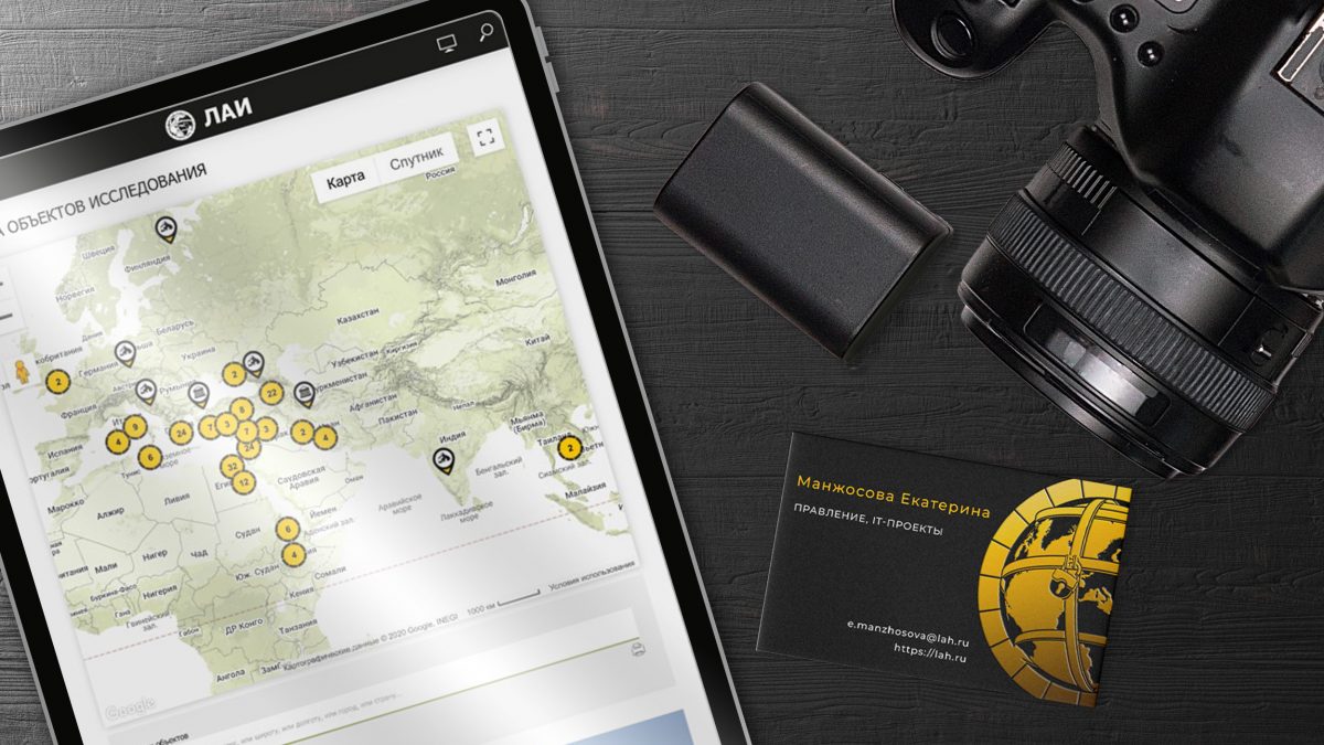
LAH Research Center Rebranding

Andrew Sklyarov the scientist and the leader of ‘Laboratory of Alternative History’ never give much attention to marketing, branding and other boring stuff. Since the project was founded in 2005 it had various logos and colors and typefaces… As many people familiar with Photoshop were in the project so many styles this brand had. That was not a big problem because most of members of ‘LAH’, as our leader, were focused on ancient history, paleontology and archaeology, not on the PR and financial goals.
Anyway, in late 2016 we, the ‘LAH’ founders, decided to bring corporate identity to one design. In all variations of logotype we’d chosen the first one, that appears in early Andrew Sklyarov’s films. I redrew old logo in vector, made it flat and a bit less complicated and open the lock that tells “we’re almost find the truth”. Then I’d chosen color pallet and typefaces for ‘LAH’ brand. I had no time to make a brand book but I share all settings to our team. That style is the base of the ‘LAH’ website design. And I made PowrPoint template you can see the example here.

